This is the number 4 of our post series about the new direction we plan to take regarding plugin maintenance and evolutions. Our first post was about shared our new purpose, the second one explained how we think we can better organize the BuddyPress plugin, and the third one dealt with BuddyPress’ next features. It’s now time to analyze the feedback you shared with us here & there about BuddyPress’ user interfaces.
Key feedbacks about the BuddyPress UI
- « Deep admin integration for all core components and logged-in Members »
- « A default set of universally wrappable theme-side template parts »
- « Modern UI/UX »
- « Make a simple theme for BP so that developers can modify it as they please. Install the theme when BP is installed »
- « I believe BuddyPress can be ground breaking for any mobile app that built with WordPress »
- « I was a little disappointed when I saw that it is not at all possible to use Gutenberg to style the absolutely required pages »
- « Most people install BuddyPress with a default theme and the result is not pretty. A BuddyPress theme that looks modern and nice would be a great addition. »
A standalone Modern theme!
10 years ago we took a very ambitious challenge when we made rendering BuddyPress templates into most WordPress themes optimal 👩🏼🎨. Being able to have a community area looking pretty nice, right away, into your site without having to change for a specific theme was and I believe is still great and quite impressive! By the way and even if we should overcome our dependency to jQuery (it’s on our todo list), our « Legacy » & « Nouveau » template packs already behave well with the next generation of themes (the block ones).
That being said, as John who regularly shares with us his will to build a brand new & modern theme 👨🏽🎨 for the project, I feel we should build it as soon as possible & deeply explore the new possibilities provided by the WP Block API like I’ve announced in episode 3 of this series. We’ll make customizing your community area a piece of cake thanks to the WordPress Site Editor, you can count on us!
What about bringing back the BuddyPress Dashboard?
I agree we should also improve the BuddyPress Administration experience to let Members manage their community content and update it just like it’s possible on front-end. Moreover, I think this community member dashboard can act as a plan B or a fallback 🆘 if something went wrong on the front side due to a JavaScript traffic jam, for example. This dashboard can also become the only community area if some site admins need to dedicate the front-end to top-down content and collaborate on it from the back-end.
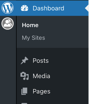
Taking the community member dashboard road also re-opens the discussion about where administrators should manage and moderate BuddyPress settings and content. Before version 1.6, we used to put everything about BuddyPress inside a top level Administration menu. I believe we should come back to our initial idea and improve it. I like what John suggested a while ago about introducing a new column before the WP Admin menu to switch between the WordPress dashboard and a new BuddyPress dashboard, a bit like the column Slack adds to switch between your Slack spaces.
A BuddyPress Progressive Web App?
About the Mobile App (or the Desktop App) point 🤳🏿. I’d love, just like it’s possible to manage sites thanks to the WordPress project’s App, to have an App to manage my different BuddyPress profiles, starting with this one and this other one 😉.
I had the chance to participate to a demo of such an App for BuddyPress and I must admit I was really amazed by the fluidity it gave to user interactions and conversations. To be honest I doubt the project will have one in the near future, but if some of you are motivated to help the team explore this world, we’d be very happy to be shown the path. We will be making sure our next/first BuddyPress Block theme is optimized for all devices and exploring/testing the Progressive Web App (PWA) direction.
To sum-up about modernizing BuddyPress UIs, we’ll do our best to reach a first milestone before 2024 starts and we are very open to contributions!
Our next & final post of this series will analyze your feedback about the BuddyPress community & how we need to improve the tools we use to manage contributions to BuddyPress.
Props: many thanks to @dcavins for his review 😘

Interesting but the post raises more questions than it answers
1. Deep admin integration
What does this mean, I’m confused. Right now the backend has MORE functionality than the front end for managing a site. I get annoyed every time I try to manage a group and realise sone functionality is backend only. Sure feature parity is the goal?
2. Block integration, great idea.
3. New buddypress theme. Maybe but many won’t use it as it won’t be that useful for hybrid sites
4. Modern UI. Well it depends, please don’t keep building JavaScript functionslity on the front end. Everything should work via html and be progressively enhanced. That’s good practice
5. Buddypress apps. Well the average user installs zero apps per year on a net basis. The future is pwas but there are many ways of doing pwa’s. The only requirement is a site with a service worker with offline capability and install ability
Until WordPress standardises a service worker api I’d rather not see buddypress create its standard as it will interfere with other solutions (sites can only have one service worker)
[…] Visit Direct Link […]
[…] @im4th & @dcavins talked about the fourth post of this series: @dcavins did the review process and it’s now available on BuddyPress.org. […]